Checkout Display tab
Path: Vayapin → Settings → Checkout Display
Two things reach the shopper: the autofill widget and the consent checkbox. The tab controls where the widget sits and which theme it uses. Everything else, including every word on screen, is fixed by VayaPin.
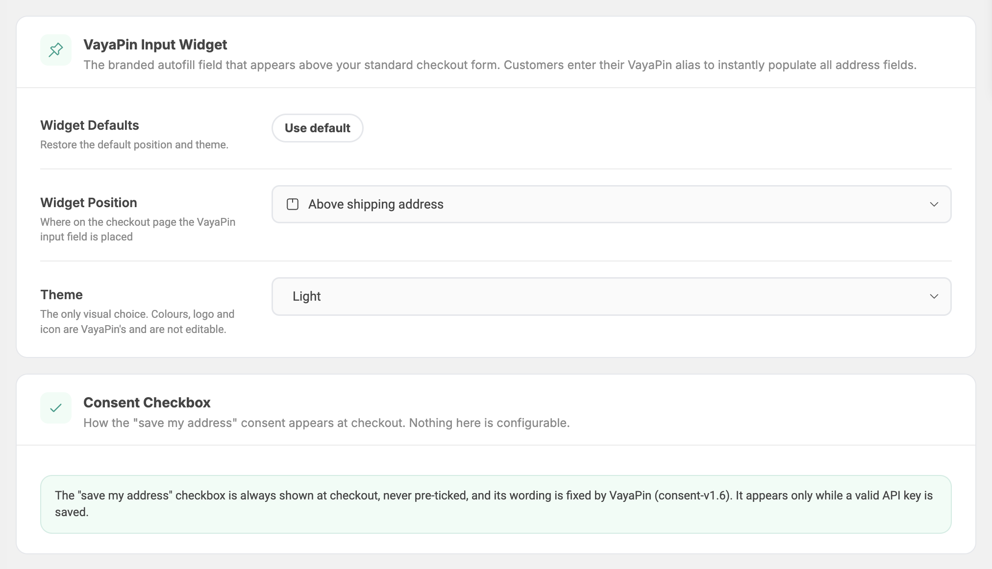
VayaPin Input Widget
The branded autofill field that appears above your standard checkout form. Customers enter their VayaPin alias to instantly populate all address fields.
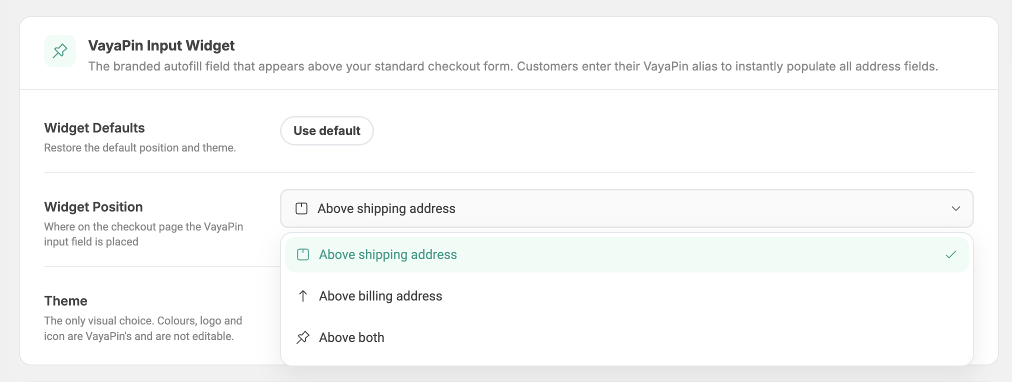
Widget Position
Where the widget renders on the checkout page. Three options:
| Option | Best for |
|---|---|
| Above shipping address (default) | Most stores, since the address the shopper cares about is the delivery one |
| Above billing address | Checkouts where billing is the primary address block |
| Above both | Themes that show the two address blocks far apart |
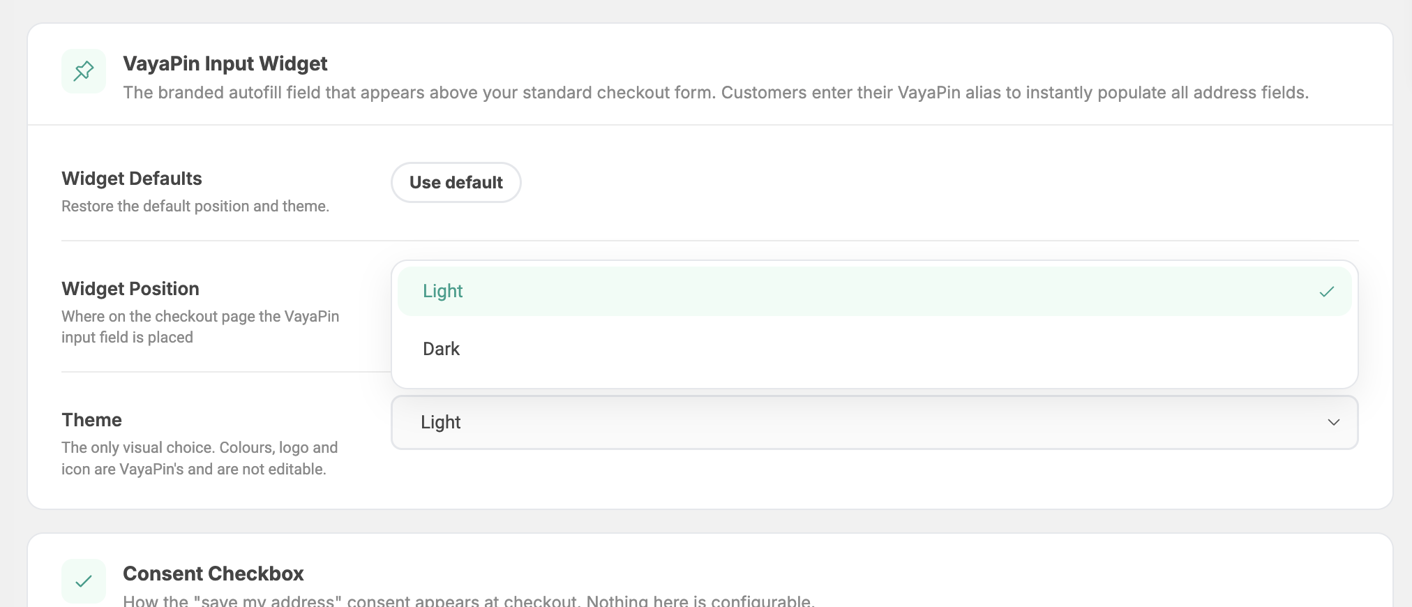
Theme
Light or dark. This is the only visual choice: colours, logo, icon, copy and corner radius are VayaPin's and are not editable. Pick Dark when your checkout sits on a dark background.
Widget Defaults
A one-click Use default button. Puts position and theme back to how they ship.
What the shopper sees
The widget has three states and swaps between them in place, so nothing on the checkout page moves.
Collapsed. A single pill. This is all a shopper sees unless they reach for it.

Expanded. One row: country, the alias field, GO, and a close button. Nothing is looked up until GO or Enter, so typing an alias sends no requests.

Filled. One confirmation line naming the Pin that filled the form, with a link back. The fields it filled stay editable.

The widget renders only while a valid API key is saved. Without a key the checkout looks exactly as it did before the plugin.
Consent Checkbox
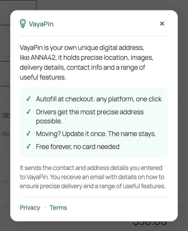
How the "save my address" consent appears at checkout. Nothing here is configurable.
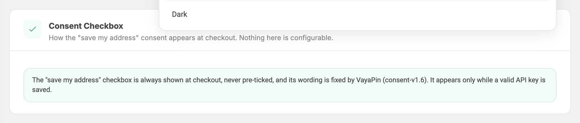
The checkbox sits after the address fields and before payment. Its wording, its version id and its behaviour are set by VayaPin and cannot be changed or switched off by the merchant:
- It is never pre-ticked. A tick is always the shopper's own action.
- The wording is fixed and carries a version id (currently
consent-v1.6), which is stored with every tick so a consent can be tied to the exact text that was on screen. - It appears only while a valid API key is saved.

Behind the small i is a short explainer with links to the Privacy Policy and Terms of Use.
Consent has to be provable. If merchants could reword the checkbox, VayaPin could not show what a shopper actually agreed to, and the stored version id would mean nothing. The same reasoning covers the widget: one set of words and colours everywhere makes VayaPin recognisable at a checkout the shopper has never used before.